Dining room paint colors, from deep and moody to warm and light
· 6 min read · By GK Painting & Remodeling
The best dining room paint colors are the ones that look good by lamplight, because that's when most dining rooms are used. Deep browns, greens, navy and wine reds are a natural fit for the room, and warm whites, clays and muted greens are the lighter route.
Here's how to choose for the light you actually eat by, why dark and moody colors work so well in a dining room, and what painting a deep color takes. When you're ready to have it done, our interior painting service handles walls, ceiling and trim together.
Start with the light you eat by
A kitchen is used all day. A dining room is mostly used at night, and the light then comes from a chandelier, sconces and candles, not the window. That's why a color that looked fine in the store, under daylight-style bulbs, can look different once dinner starts.
Bulbs are rated on the Kelvin scale. The U.S. Department of Energy explains that higher numbers look cooler and bluer and lower numbers look warmer and more yellow. Wikipedia's table of color temperatures lists a candle flame at 1,850 K, soft white bulbs at 2,700 K and warm white bulbs at 3,000 K, against daylight at 5,000 K and above. A dining room lit at 2,700 to 3,000 K, or by candles, is lit by yellowish light, and that changes how every color on the wall reads.
Try this before you buy paint: on a dinner night, turn off the overhead lights and look at the room with only the lamps and candles you normally use. That's the light your color will live in, and it's the light to test it under.
Why dark and moody colors work in a dining room
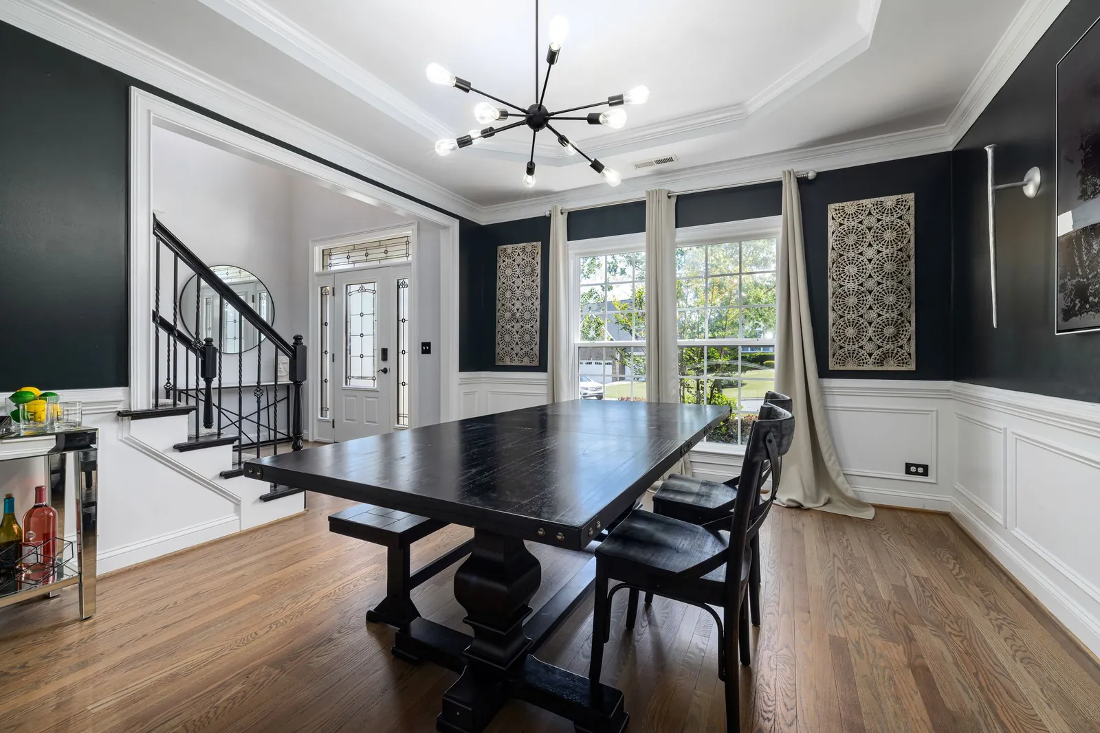
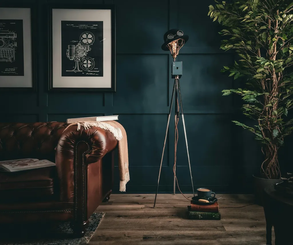
People enter a dining room for an occasion. They sit still, the table is the focus, and nobody is folding laundry or reading small print. Those are the conditions where a deep color does its best work: dark walls let the edges of the room recede, so the table and the people come forward, and warm lamplight on a deep wall reads as rich rather than heavy.
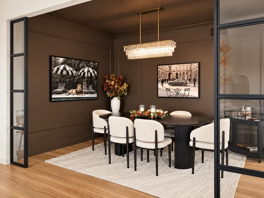
The dining room in the photo on this page is painted deep chocolate brown, with the walls and the panel moulding in the same color. Brown is a dark color that reads warm instead of cold, which is why it suits a room lit mostly by lamps. Other deep colors worth a look:
- Chocolate and espresso brown. Warm, and flattering to wood furniture and brass.
- Deep green. Forest and bottle greens look good by candlelight and next to white china.
- Navy and ink blue. A cooler dark option that still glows under warm bulbs.
- Wine, oxblood and plum. Classic dining room reds with depth.
- Charcoal and black-brown. Dramatic, with strong contrast against white linens and light trim.
Deep walls also make everything in front of them stand out. A gold mirror, white china, framed art and the table itself all gain contrast against a dark ground, which is a lot of the reason these rooms feel finished.
What light reflectance means for a dark room
Paint makers print a light reflectance value, or LRV, on many paint chips. Zero means a surface reflects no light, and the top of the scale means it reflects all of it. A dark color sits near the bottom, which means the walls give back very little of the light in the room.
That's the real trade-off with dark colors: the light sources have to do the work the walls won't. Plan sconces, a chandelier on a dimmer, or lamps on a sideboard before you choose the color. The Department of Energy notes that most LEDs are dimmable, which makes it easy to turn the room down for dinner and up for cleanup.
Warm bulbs flatter dark paint
On a dark wall, the bulb matters even more. Warm bulbs, at 2,700 to 3,000 K, bring out the red in brown, the yellow in green and the depth in wine. Cool daylight bulbs, at 5,000 K and above, push the same walls toward blue and flatten them. Changing a bulb can shift the look of a room as much as a second coat of paint.
Check the color temperature printed on the package, and use the same kind across every fixture in the room. A mix of warm and cool bulbs makes walls look patchy and takes the glow out of a deep color.
Lighter options that still feel dressed up
If a dark room isn't for you, there's plenty of middle ground:
- Warm white with some body. A cream or soft greige with depth, not a stark white.
- Muted greens and sages. Gentle in daylight and richer in the evening.
- Clay and terracotta. Warm tones that look best by lamplight.
- Dusty blue or blue-gray. Calm, and a good match for white trim.
- Two tones. A darker color below a chair rail and a lighter one above gives you some drama without the whole room going dark.
Test whites in the evening in particular. By warm lamplight, a white with a yellow undertone can drift toward butter yellow, and a cool white can look gray. The one that looks right at dinner is the one to buy.
If your dining room faces north, the daylight is cool, and colors shift toward blue. Our post on paint colors for north-facing rooms explains what to do about it. Splitting a wall into two colors is another option; see two tone wall ideas.
Walls, ceiling and trim together
In a dining room, the ceiling and the trim are part of the color story. There are three common approaches:
- One color throughout. Walls, trim and ceiling in the same color feel enveloping and hide the lines where surfaces meet.
- Dark walls, white trim. Crisp and traditional, with the trim framing the room.
- Dark walls, lighter ceiling. A soft white, or a pale tint of the wall color, lifts the ceiling and keeps the room from feeling closed in.
Sheen matters on dark walls. A flat or matte finish hides roller marks and surface flaws and keeps a chandelier from glaring back, while satin or semi-gloss on the trim wipes clean. Our guides to paint finish for each room, painting baseboards and the best ceiling paint go through the options. Our post on color drenching a room, ceiling included covers when that works.
What painting a deep color takes
Deep colors ask a little more of the job. They usually call for primer and enough coats to cover evenly, and flaws show more on a dark wall, so prep matters. Small holes are repaired, surfaces are cleaned and sanded, and everything is primed before the color goes on.
Dunn-Edwards notes that dark colors, which carry a high load of pigment, typically take longer to dry and cure than light ones. The room is ready to use when the job is done, but keep chair backs from rubbing the walls and don't scrub the paint for the first few weeks.
If you ever want to go back to a light color, our guide to painting over dark paint explains what that takes. It's a reason to choose a dark color because you love it, not because it's the season's color.
Test it at the table
- Paint a large sample on at least two walls.
- Look at it at dinner time with the bulbs you'll actually use, and again in daylight.
- Hold it up against your table, chairs, floor and dishes.
- Live with the samples for a few days before you commit.
Our guides to how to test paint colors and how to choose paint colors for your home go through each step.
Interior painting is priced by the square footage of the space, with paint included, and most rooms take one to two days. We paint homes and businesses across Madison and Dane County, including Sun Prairie. When you're ready, ask for a free estimate.
Common questions
What color should I paint a dining room?
Choose for the light you use the room in, which is mostly evening lamplight. Deep brown, green, navy and wine look rich by lamplight, and warm whites, clays and muted greens are the lighter options. Test a large sample at dinner time before you decide.
Are dark colors too much for a small dining room?
Not always. Dark walls let the corners recede, which can make a small room feel snug rather than cramped. They work best with several light sources you can dim, so plan the lighting before you choose the color.
What light bulbs are best for a dining room?
Warm bulbs in the 2,700 to 3,000 K range, which the Department of Energy says look warmer and more yellow, like incandescent light. Put the fixture on a dimmer, since most LEDs are dimmable. Daylight-style bulbs at 5,000 K and above look bluish and flatten dark colors.
Should the dining room ceiling match the walls?
It can. One color on walls, trim and ceiling feels enveloping and works well with deep colors. A white or lighter ceiling adds lift and contrast. Look at a large sample of both before you decide.
How many coats does a dark color need?
Primer plus two coats of color is a common starting point. The exact count depends on the color and the surface underneath, so George will talk it through when he quotes. Dunn-Edwards also notes that dark colors take longer to dry and cure than light ones.
Sources
- Color temperature, Wikipedia
- Consumer Guide to Energy-Efficient Lighting, U.S. Department of Energy
- Light reflectance value, Wikipedia
- Dry Time versus Cure Time of Paint (technical bulletin), Dunn-Edwards
More on interior painting and every interior painting post.